CANADIAN TIRE | MOTOMASTER
A BRAND KICKS
INTO OVERDRIVE
The classic Motomaster brand was tired. They needed an approach that brought authority and automotive cred to a brand that stretched over a 1000 skus and could compete with national brands.
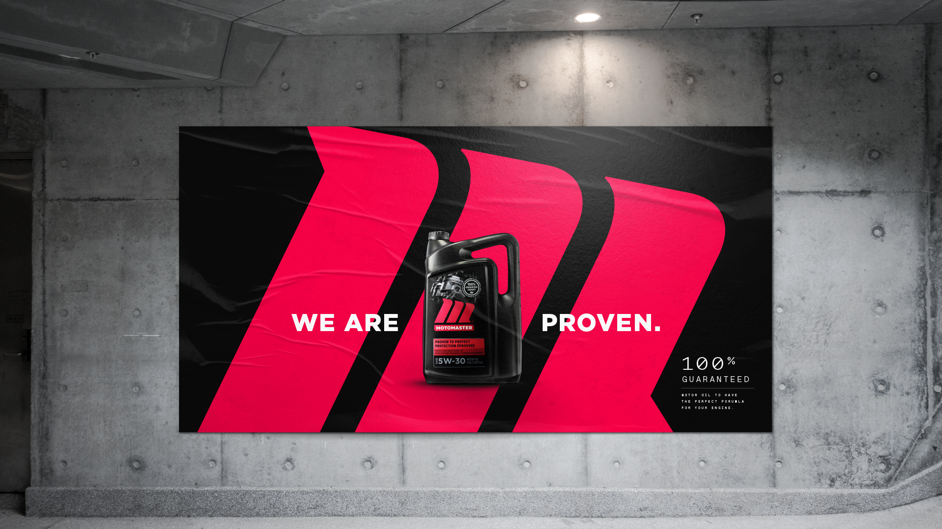
The new design is inspired by iconic automotive branding, the foundation of the rebranding is the badge-worthy M icon. Capturing the essence of movement, the identity injects the brand with the agility it needs for seamless application across categories and channels. It’s proud, sleek, and authoritative – putting Motomaster confidently in the driver’s seat.
Credits:
Paul Scarfo: Branding, packaging, art direction, in-store, brandbook
Agency: Davis - Integrated Branding


