CAMPBELL’S US | PREGO
SHARE THE LOVE
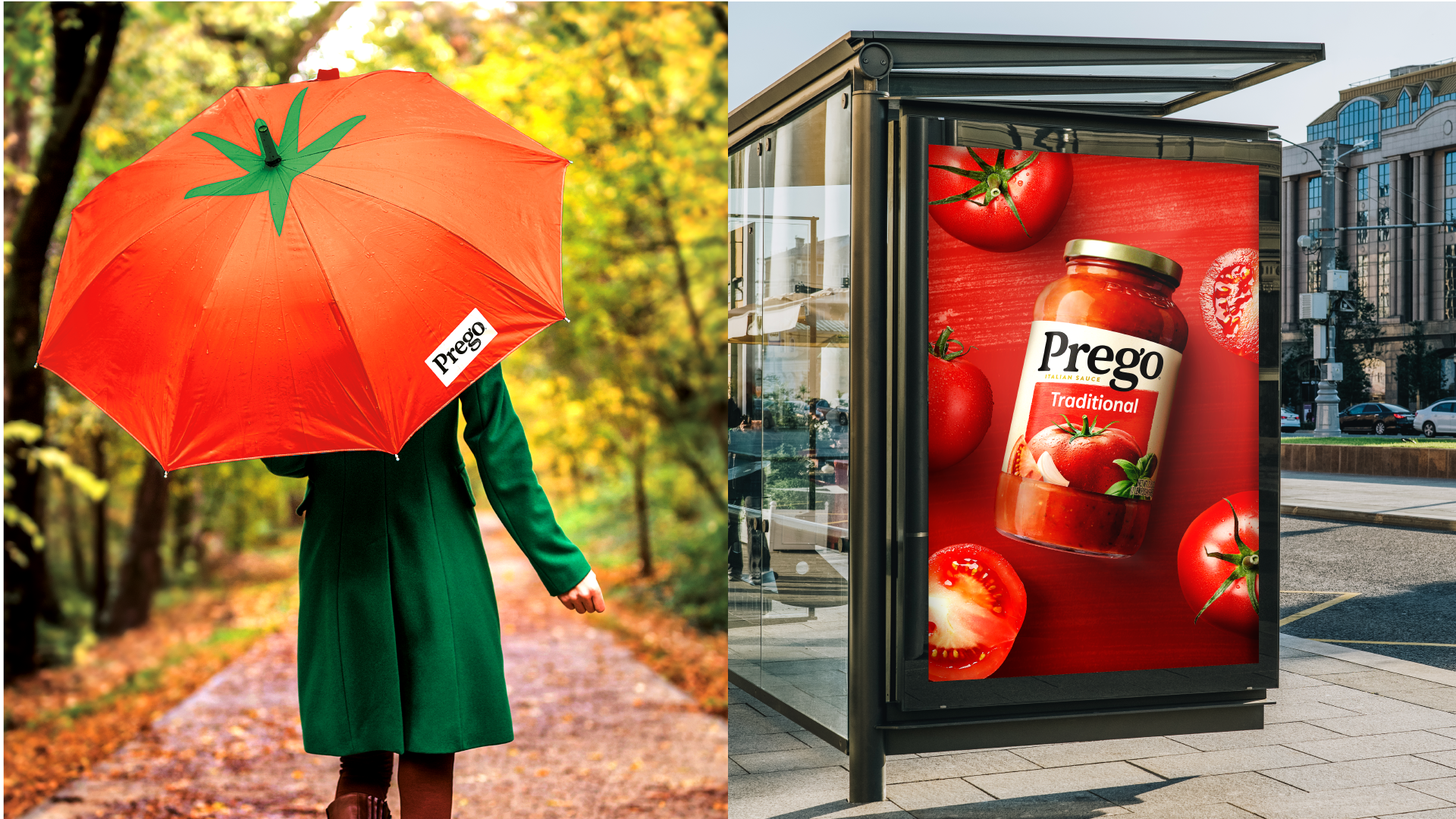
Simple, unpretentious visual storytelling makes Prego approachable and easy to love.
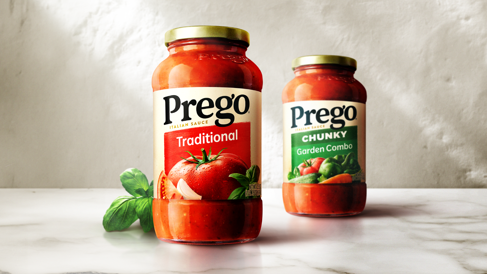
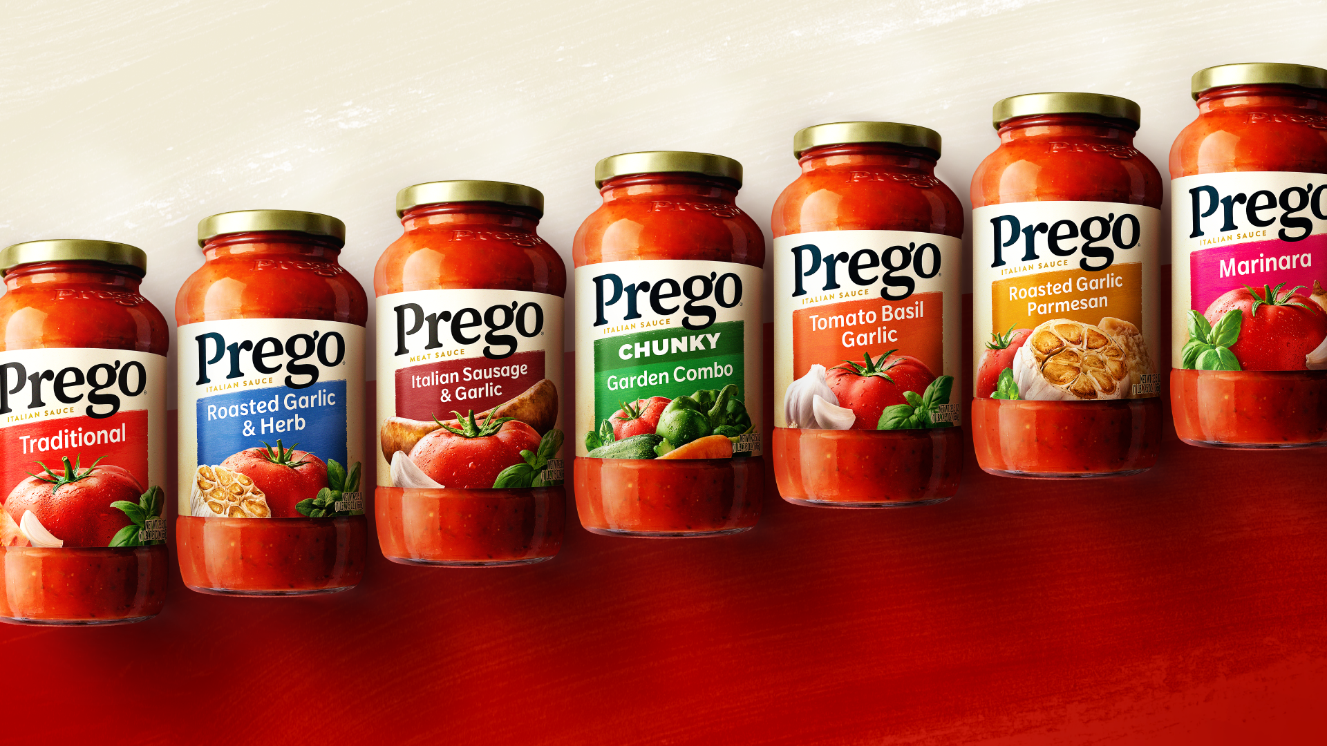
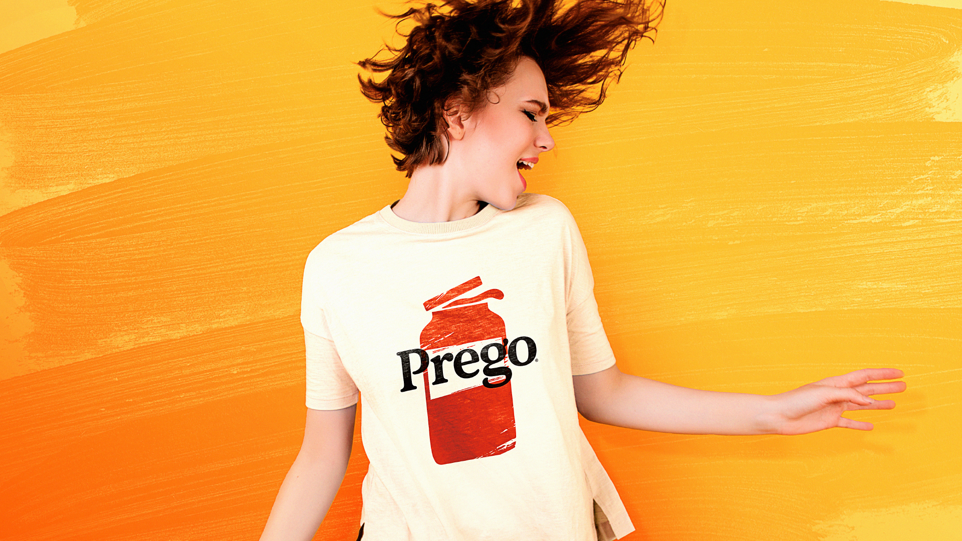
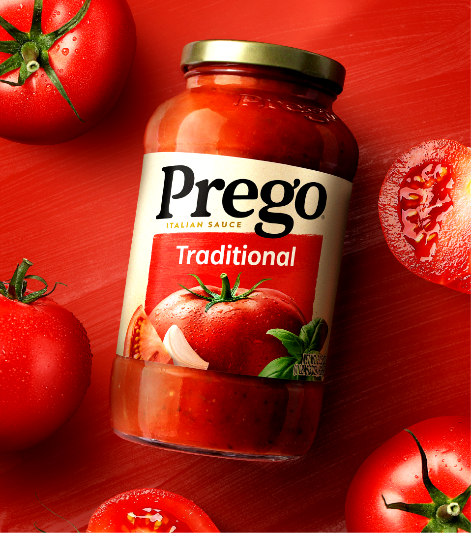
The new design has the Prego brand proudly displayed with ample negative space. The word mark has been redrawn and stripped down while maintaining the quirkiness that makes the Prego word mark memorable; such as the “ear” and the interactive descender on the g.
The design showcases classic ingredients bursting with freshness and dramatically portrayed bleeding off the bottom of the pack. The redesign is confident, yet warm and inviting, there’s an energetic attitude that disrupts with distinction and supports the trustworthy stature of the brand.
Credits:
Paul Scarfo: Branding, packaging, art direction, brandbook
Agency: Davis - Integrated Branding
