STONYFIELD ORGANIC
ORGANIC
LIVES HERE
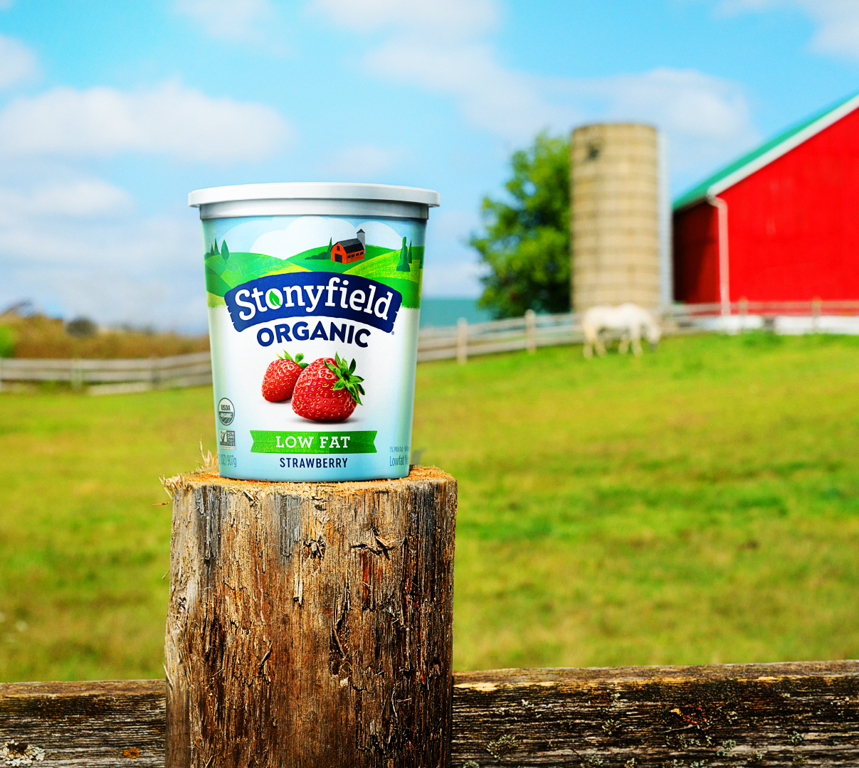
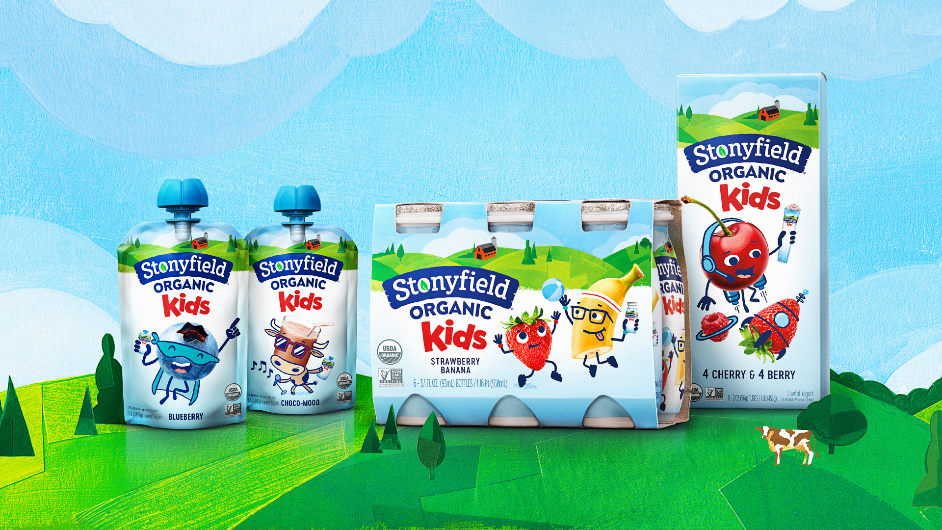
The rebrand maintained a simple and clean aesthetic, leveraging the familiar category white palette, but using distinct typography and bold color to disrupt. The playful, illustrative characteristics also help the brand stand out on shelf.
This farm story also acts as a masthead that ties together the family of offerings, and garners greater attention, while still allowing the different segments to be clearly understood. The farm acts as the hero, highlighting the brand’s light-hearted personality, organic leadership and dedication to food that makes a difference in the world.
Credits:
Paul Scarfo: Branding, packaging, art direction, brandbook
Agency: Davis - Integrated Branding
Illustration: Darren Booth


